A Major Update to ReleaseWire Coming in 2020!
Below we provide information about a major update coming to ReleaseWire. Before we begin, we would like to ask for your feedback on how we can improve our site and service. To provide your feedback please click here.
In 2005, we launched the first version of ReleaseWire. At that time, the internet and web technologies were vastly different. Almost all our clients used a desktop only browser, and most used Microsoft’s Internet Explorer which had an 85% market share in 2005. Firefox, our preferred browser had an estimated 10% share of the market. The typical internet connection in the US was 3 Mbps, where as today, the typical Internet connection in the US is 19 Mbps.
Mobile web technology pretty much was nonexistent in 2005. The most popular cell phone was the Nokia 1110. The Motorola Q, an early popular smartphone, sold about 1 million phones in 2005.
Today, Apple iPhones make up as much as 57% and Android based devices make up to 42% of the US market. Worldwide, Android leads with 74% market share to Apple’s iOS having 25%.
Web technologies were very different in 2005 as well. Most web sites used static HTML web pages, generated by a backend server which exported their content. Later, sites became more dynamic with much more usable database servers along with much enhanced JavaScript based solutions for providing rich dynamic experiences, without reloading every page.
During the past 15 years, ReleaseWire has added many additional features and applications to our service. These new features offer many benefits to our clients. However, a side effect has been an increase in the workload on our ageing infrastructure and a loss of consistency with the ReleaseWire user interface.
Over time, many parts of the ReleaseWire user interface ended up with redundant features and settings, navigation became different depending on which app you were currently using. The overall account manager became hard to navigate due to the increasing number of features, often making those features hard to find and lowering their usage among our clients.
Today, ReleaseWire starts the beginning of our beta phase of a major update to our site, including a major new design update along with large improvements to our back-end infrastructure.
The design goals:
Mobile Friendly: We realize that many of our clients use a mobile browser to access our site. As such, we have worked on making all of our services accessible via mobile browsers.
New "Dark Mode": Many of our clients have shared with us that they prefer dark mode applications. The new ReleaseWire will include a full dark theme.
Simplification: With this update, many redundant or confusing steps to completing tasks have been removed.
Separation of Features: When the new ReleaseWire is launched, applications such as ReleaseWire CRM, ReleaseWire Hosted Newsroom and ReleaseWire for Journalist, will have their own location, making it easy to directly access the feature you wish to work with. Integration with other ReleaseWire services will remain and be improved.
Update Release Plan:
ReleaseWire has begun working with a limited number of clients who are testing this new update. The feedback gained from this group will help us to prioritize the improvements needed to be made before a public beta version is launched.
We plan to announce a public beta version of the new ReleaseWire in March. Our goal is to retire the current ReleaseWire Account Manager before July of 2020.
One aspect that would be very helpful to our team is to learn more about the areas of our site which you find difficult to use. Additionally, we would like to know what site features you wish our site offered. Your feedback is very important to us.
To submit your suggestions please click here.
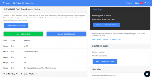
Let's have a look at an early version of the new ReleaseWire beta:
The first thing you will notice, is text in the new user interface is more spaced out, making it easier to read,
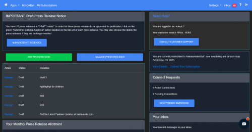
Here is the same dashboard with our new "Dark Mode" theme.
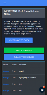
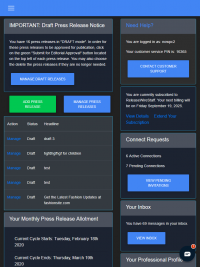
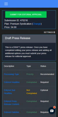
The new ReleaseWire offers mobile and tablet friendly views.
Here is the account dashboard on a mobile device:
And here is the same account dashboard on a mid-sized tablet:
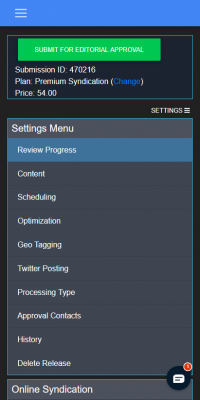
Sub menu navigation has been improved with this update as well. On mobile devices, left side menus are now visible when you need choose, by taping on the "Settings" button.
Here is the same page with the settings menu open:
There are a large number of subtle changes to the new user interface along with a focus on optimizing applications so they load faster and require less clicks to complete tasks.
We will be posting updates on our blog as we continue to develop this major update.
As always, your feedback is very important to us. Please let us know what you think of the new design or if there are any features you would like to see us add to the new account manager.
